Imagine stumbling upon a hidden gem in the forest — glittering in sunlight, rare, and valuable. That’s what a diamond chart pattern feels like in trading. It doesn’t appear often, but when it does, it reflects the psychology of chaos settling into clarity — and offers sharp trading opportunities.
Let’s dig deep into this sparkling pattern, how it forms, and what the laws of demand and supply whisper beneath its jagged surface.
✨ What is the Diamond Chart Pattern?
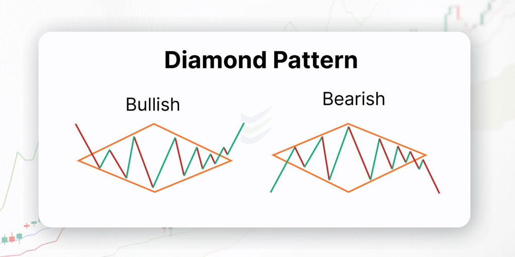
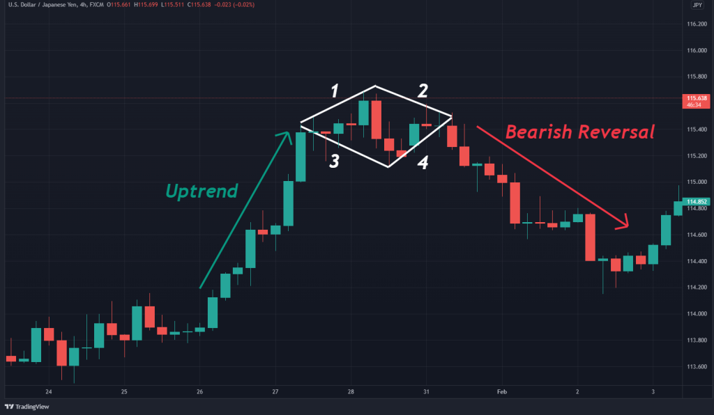
A Diamond pattern forms when price volatility expands and then contracts, creating a shape that resembles a diamond or rhombus on the chart.
- It can appear at the top of an uptrend (Diamond Top – bearish reversal).
- Or, it can form at the bottom of a downtrend (Diamond Bottom – bullish reversal).
Though rarer than patterns like head-and-shoulders or triangles, diamonds can signal strong trend reversals due to the intensity of emotion packed inside them.
🧠 The Psychology Behind the Diamond: Demand vs. Supply
Let’s decode this visually chaotic pattern through a calm conversation between demand and supply.
📈 In a Diamond Top (Reversal):
- The uptrend attracts buyers – demand is hot, and prices rise.
- Suddenly, price starts swinging wildly. Volatility increases.
- Buyers keep pushing new highs.
- Sellers fight back aggressively – it becomes a battlefield.
- Then something shifts — price movements start shrinking.
- Momentum fades.
- Uncertainty rises.
- Smart money begins exiting quietly, while the public still hopes.
- Eventually, supply overpowers demand – price breaks down.
- Panic sets in.
- A clean reversal unfolds.
📉 In a Diamond Bottom (Reversal):
- A bearish trend has worn traders out – demand is weak, and sellers dominate.
- Price starts to whip around unpredictably, forming large candles in both directions.
- Buyers start testing the waters.
- Sellers try defending, but they’re tired.
- Price range starts tightening.
- Smart buyers accumulate quietly.
- Supply dries up.
- Then boom — a strong breakout upwards, as demand explodes.
- Fear turns into FOMO (fear of missing out).
- A new trend is born.
🧩 How to Identify the Diamond Pattern
🔍 Spotting the Shape:
- Start from a sharp trend (up or down).
- Then, you’ll see price action start to form a broadening wedge – highs and lows stretch outward.
- After that, it contracts back, forming a symmetric narrowing.
- Result: A diamond shape.
🧭 Key Characteristics:
| Feature | Description |
|---|---|
| Trend Before Pattern | Strong (up or down) |
| Volatility Phase 1 | Expanding (broadening highs/lows) |
| Volatility Phase 2 | Contracting (narrowing highs/lows) |
| Volume Behavior | Erratic at first, settles before breakout |
| Breakout Direction | Reversal or rare continuation |
🔥 Why Does the Diamond Pattern Form?
In simple terms: confusion followed by resolution.
- It reflects a market that’s unsure — where both bulls and bears fight fiercely.
- The pattern is built by indecisiveness, and eventually, the side with the stronger conviction wins.
- Smart traders can ride this shift from noise to clarity.
🎯 How to Trade the Diamond Pattern
🟠 Entry:
- For Diamond Top: Enter short when price breaks down below the lower trendline.
- For Diamond Bottom: Enter long when price breaks above the upper trendline.
- Look for volume confirmation during breakout. Bigger = Better.
🟡 Stop Loss:
- Place your stop just outside the opposite side of the diamond.
🟢 Target:
- Measure the height of the diamond (vertical distance).
- Project it from the breakout point in the direction of the breakout.
Example:
- Diamond height = ₹20
- Breakout price = ₹100
- Target = ₹80 or ₹120 (depending on direction)
🕯️ Bonus Tip: Supporting Candlestick Signals
Watch for these candlesticks at breakout zones:
- Doji or Spinning Tops inside the diamond → signal indecision.
- Engulfing candles at the breakout → strong confirmation.
- Gap-ups or gap-downs from the pattern → adds momentum.
🧠 Indicators That Help
- Volume: Volume spike at breakout is crucial.
- MACD: A crossover in the breakout direction adds confirmation.
- RSI:
- Diamond Top: RSI overbought (>70) → bearish signal.
- Diamond Bottom: RSI oversold (<30) → bullish signal.
🧩 Diamond Pattern vs Head and Shoulders
| Feature | Diamond Pattern | Head and Shoulders |
|---|---|---|
| Shape | Rhombus-like, complex | Three peaks, simple |
| Frequency | Rare | Common |
| Emotion | High volatility | Gradual sentiment shift |
| Breakout Speed | Often sharp | Can be gradual |
🥂 Conclusion: Not Just a Sparkly Shape
The diamond chart pattern isn’t just technical gibberish or geometric trivia. It’s a poetic reflection of uncertainty transforming into momentum — a battle between hope and fear, clarity and chaos.
Trading this pattern isn’t just about lines — it’s about reading the pulse of the market crowd. Master the art of spotting it, and you might just catch the next big reversal before the masses even realize what’s happening.